


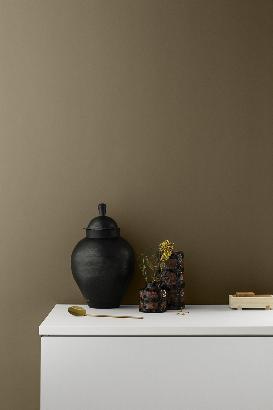
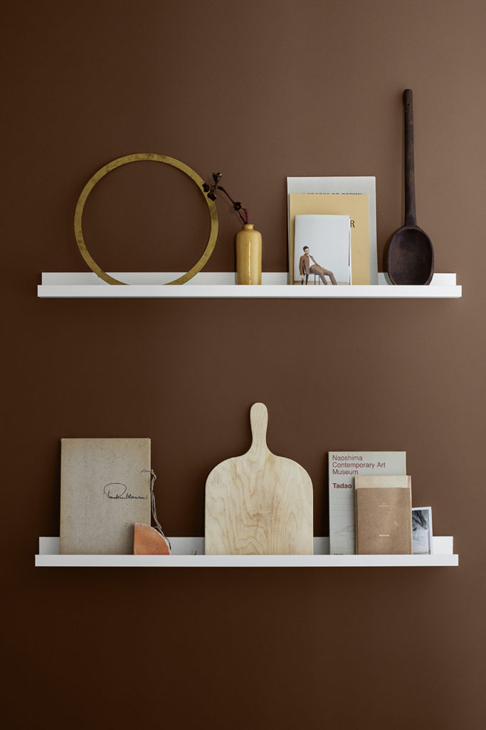
LADY 10963 Golden Bronze
Rhythm of life // Jotun Lady Colour Chart 2018
I have just painted my first room at home with paint from Jotun and I must say I am hooked. The quality of the paint and the color charts are on point. It really makes it so much harder to choose. Jotun are known to use a lot of time and resources for their research on tendencies and to develop colors that not only look beautiful but that you actually will love surrounding yourself with. The press photos are usually pinned away in infinity because of of the beautiful colours and perfect styling and shot at some of the prettiest locations by Danish photographer Line Klein and styled by the the Norwegian stylist duo Kråkvik & D´Orazio.
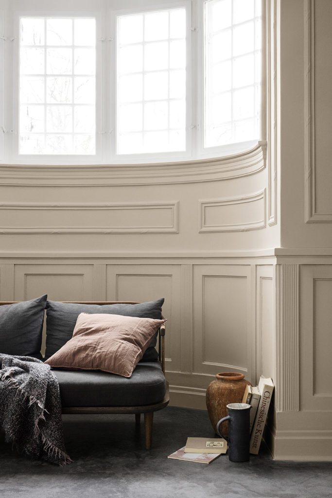
The new chart is called Rhythm of Life. Because life at home has its own pulse, a rhythm that effects the way we live, choices we make and how we see the world. The color chart consists of 32 colors and it´s designed to make it easy for us to create a well balanced palette throughout our homes. The paint LADY Pure Color is launched in a new version, even more matte to create a luxurious feel. The color chart represents global color tendencies where it the last few years has been less white walls and more use of colors. This week Jotun presented 3 tendencies: City Motions, Silent Serenity and Lush Garden.
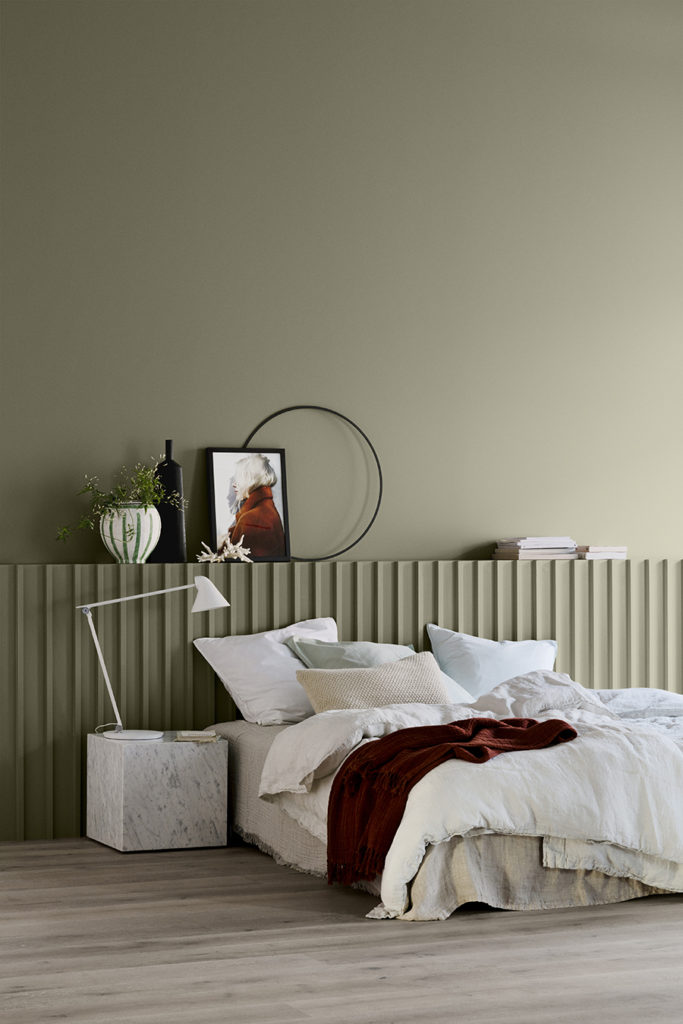
My favorites are the LADY 8302 Laurbær, LADY 10963 Golden Bronze and LADY 10966 Almond Beige.
LADY 8302 Laurbær
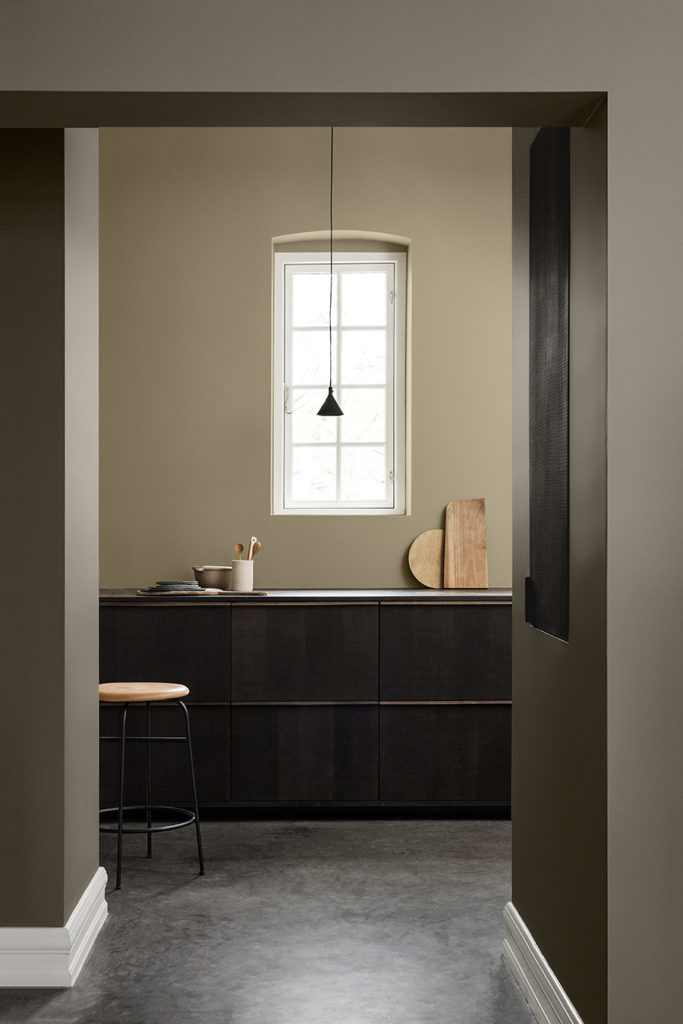
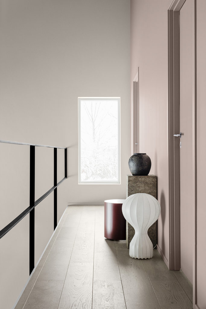
LADY 10580 Soft Skin
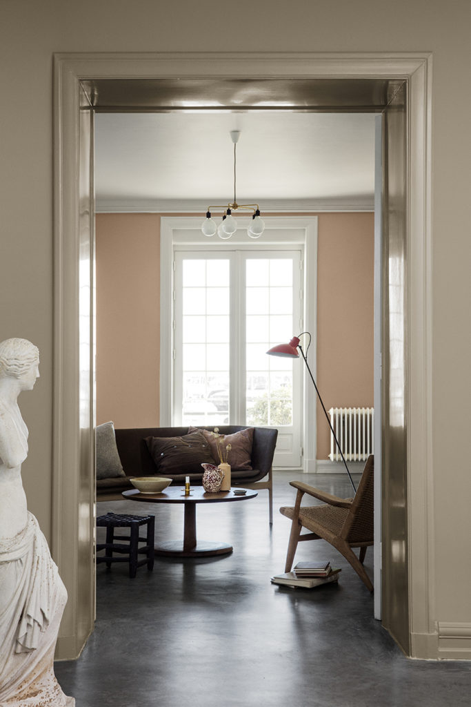
LADY 10966 Almond Beige and LADY 20047 Blushing Peach
LADY 10966 Almond Beige and LADY 10965 Hipster Brown
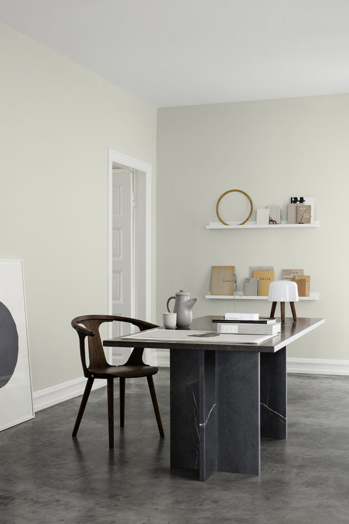
LADY 1091 Lys Antikkgrå
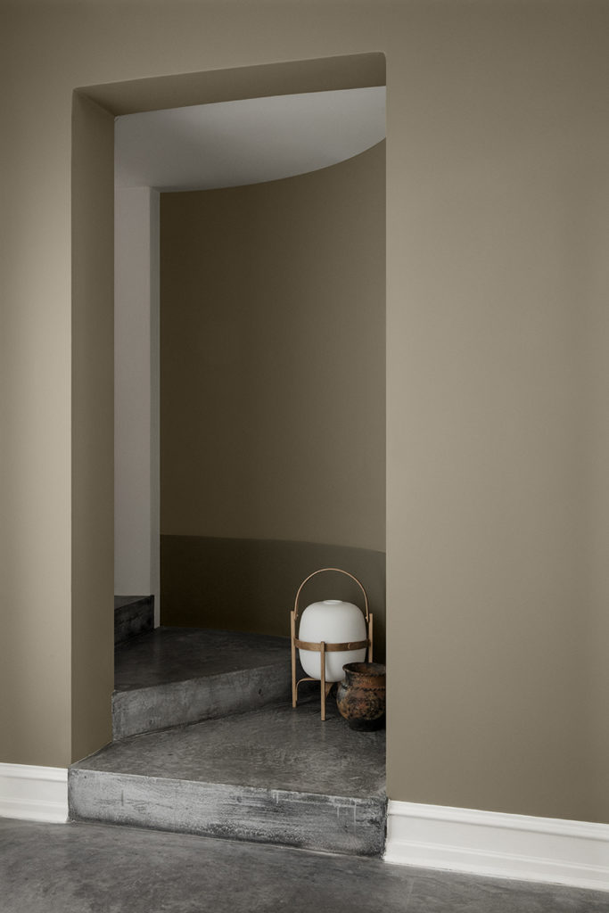
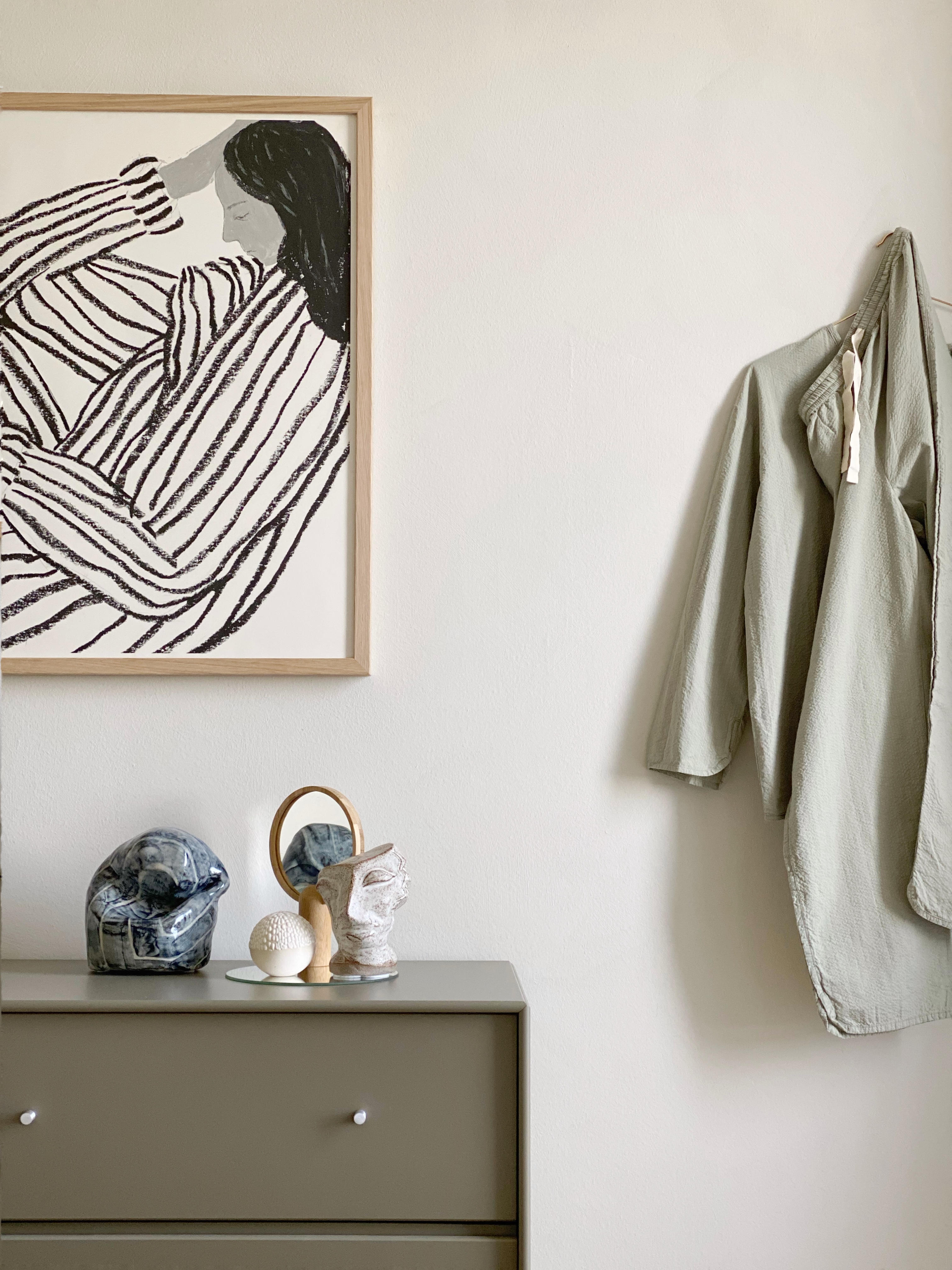
LADY 10965 Hipster Brown and LADY 10961 Raw Canvas
LADY 10981 Norwegian Wood
LADY 20054 Silky Pink
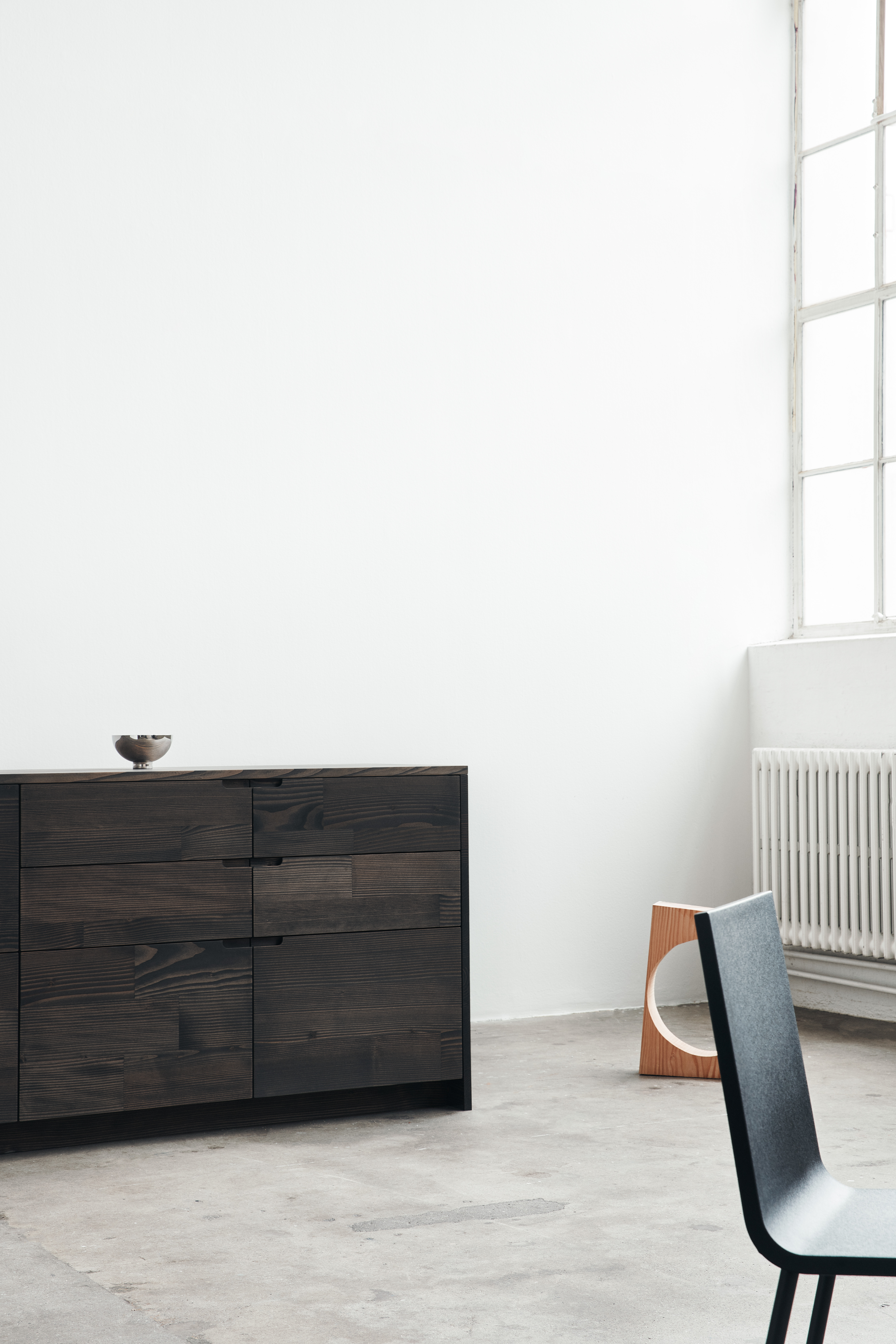
Photography Line Thit Klein, styling by Kråkvik & D´Orazio. © Jotun LADY

4 comments on “Rhythm of life // Jotun Lady Colour Chart 2018”